Final Project

14 June 2019 - 5 July 2019 (week 11-week 14)
Soo Wen Yi (0334653)Typography _
Final Project/Expression, Hierarchy and Composition
LECTURES_
Lecture 09 _ Typography in different medium
14 June 2019 (week 11)
Types on print and screen
- screen resolution, the amount of pixels can appear in the screen
How we look at typeface:
- viewport, devices, screen resolution
- looking at different aspects to design a typeface
- example hyperlink, blue and underlined
Print type vs Screen type
- adjustments made to improve readability on screen
- wider and larger on screen
- 16 pixels on screen is the best
Default font
- example Times New Roman, if the user don't have this font, it will be replaced by another font; if the user don't have the same font used, it will be replaced by another font.
INSTRUCTIONS_
FINAL PROJECT_
Week 11
Final Project
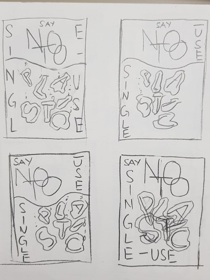
I started with thinking what bothers me around campus, and I thought about plastic bottles. I've seen a lot of people leaving their single use plastic water bottles in the class or on tables around campus. Some even have more than half of the water still inside the bottle. And I have always thought that its very wasteful both on the plastic and also the water, its also irresponsible for the people who left it. So for this idea I want to encourage people to use reusable plastics (tupperware) instead of using single use plastic. The first headline I came up with is "reusable water bottles over 1 time plastic water bottles." which I thought was too long. So I changed it to "reusable over plastic bottles".
Final Project
I started with thinking what bothers me around campus, and I thought about plastic bottles. I've seen a lot of people leaving their single use plastic water bottles in the class or on tables around campus. Some even have more than half of the water still inside the bottle. And I have always thought that its very wasteful both on the plastic and also the water, its also irresponsible for the people who left it. So for this idea I want to encourage people to use reusable plastics (tupperware) instead of using single use plastic. The first headline I came up with is "reusable water bottles over 1 time plastic water bottles." which I thought was too long. So I changed it to "reusable over plastic bottles".
 |
| Fig. 1.1: 1st sketches |
After getting feedback form Mr Shamsul and Mr Vinod, I chose to use the headline "say no to single use plastic".
 |
| Fig. 1.2: 2nd sketches with new headline |
After getting feedback from Mr Vinod at the end of the class, I made some improved sketches.
After painting all of the plastics, this is what I have.
 |
| Fig. 1.3: 1st improved sketches |
 |
| Fig. 1.4: 2nd improved sketches |
I got approved to continue working on this by Mr Vinod. I like the bottom left composition on Fig. 1.4, so I went ahead and digitised that.
 |
| Fig. 1.5: This font doesn't suit the alignment that I want to achieve |
 |
| Fig. 1.6: I changed it to "name" condensed which is more suitable |
 |
| Fig. 1.7: For the plastic, I painted a very rough outline and filled it in with grey, then used the dodge tool to add highlights and the burn tool to add shadows. |
 |
| Fig. 1.8: After that I use puppet wrap to further adjust the shape of the plastic |
After painting all of the plastics, this is what I have.
 |
| Fig. 1.9: after finishing all the plastics |
 |
| Fig. 1.10: I adjusted the letters to be closer together |
 |
| Fig. 1.11: 1st version with no bubbles |
 |
| Fig. 1.12: 1st version with bubbles |
I wanted to create some sort of waves/lines that suggest motion, so I used the pen tool in illustrator and the blend options to create the continuous lines. I created the gradient to be blue to black. I learnt this technique from Mr Jeffery when class ended.
 |
| Fig. 1.13: the wave lines done on illustrator |
 |
| Fig. 1.14: screen grab of the blend option |
 |
| Fig. 1.15: 2nd version with no bubbles (lines behind the words) |
 |
| Fig. 1.16: 3rd version with no bubbles (lines in front the words) |
 |
| Fig. 1.17: 2nd version with bubbles (lines behind the words) |
 |
| Fig. 1.18: 3rd version with bubbles (lines in front the words) |
Week 12
Mr Vinod liked the Fig. 1.14 out of every version I made. So after feedback I went to add the disintegrated plastics. I used the same method on how I painted the plastics wrapping the letters but just having a normal blending mode since nothing is overlapped.
Here's the pdf version of the final outcome:
Next I am animating this layout in after effects, I will be moving the wavy lines and the disintegrated plastics look like its floating.
The original animated version (mp4):
Here's the animated version (gif):

Week 13
The print came out nice, the types are sharp and crisp but the wavy lines are a bit pixelated.
Mr Vinod liked the Fig. 1.14 out of every version I made. So after feedback I went to add the disintegrated plastics. I used the same method on how I painted the plastics wrapping the letters but just having a normal blending mode since nothing is overlapped.
 |
| Fig. 1.19: layout of the disintegrated plastic |
 |
| Fig. 1.20: 50% progress on the disintegrated plastic |
 |
| Fig. 1.21: close up detail of the disintegrated plastics |
 |
| Fig. 1.22: Final outcome |
Next I am animating this layout in after effects, I will be moving the wavy lines and the disintegrated plastics look like its floating.
 |
| Fig. 1.23: screen shot of the interface while animating in after effects |
Here's the animated version (gif):

The print came out nice, the types are sharp and crisp but the wavy lines are a bit pixelated.
 |
| Fig. 1.24: close up of the print |
 |
| Fig. 1.25: the slight pixelated wavy lines |
 |
| Fig. 1.26: final outcome printed and framed |
FEEDBACK_
Week 11
Specific feedback
After Mr Shamsul changed the font size to be the same, Mr Vinod said its fine and the placing of the details counteracts the composition and he told me to move onto Project 1. Mr Vinod and Mr Shamsul agrees that my headline is too long and doesn't really make sense, so they told me to go improve the headline. When I showed my improved design to Mr Vinod he said its much better and I could probably research how type can lay on plastic bags or maybe have a plastic bag in the background with stuff inside coming out. After showing Mr Vinod my improved sketches, he replied: "Interesting. Continue.".
Week 12
Specific feedback
I asked Mr Vinod on facebook if he had any comment for my compositions. I showed him all 6 (with no line and with lines), he said: "I love the one with the wavy lines. Need to work more on visual comm: whether people are reading it as you are hoping. Black is not appropriate. Some more crafting and it could look better. See us in class." After the lecturers saw my design they said to remove the bubbles and add disintegrated plastics to show that its falling apart. Mr Vinod said I can either animate the waves or the disintegrated plastics, since the waves are wavy lines just move it from left to right will look like its a wave. Mr Shamsul said good work. It was approved after I finished the final outcome, and told to move on to animate it.
Week 13
Specific feedback
After Mr Vinod looked at my blog he told me to put the project title under typography instead of it being on the same line. And also finish converting my animation from video to gif and upload it to the blog. Mr Vinod asked me how did I make the lines, after I explained he said that the reason to the pixelation in the wavy lines might come from when I pasted the lines into photoshop it was a smart object but when I pasted its not the size of the final outcome. But everything was fine.
Week 14
General feedback
We should print all the required printouts from the final compilation, update the feedback sheet for this week (week 14), ask for the string from Mr Vinod when we finish compiling the printouts in the clear sheets.
Specific feedback
Change the exercise 1 final jpg to have a bigger border, final project animation could be better if the disintegrated plastics are in 3 layers and moved in different pace to make it seem more natural.
Specific feedback
After Mr Shamsul changed the font size to be the same, Mr Vinod said its fine and the placing of the details counteracts the composition and he told me to move onto Project 1. Mr Vinod and Mr Shamsul agrees that my headline is too long and doesn't really make sense, so they told me to go improve the headline. When I showed my improved design to Mr Vinod he said its much better and I could probably research how type can lay on plastic bags or maybe have a plastic bag in the background with stuff inside coming out. After showing Mr Vinod my improved sketches, he replied: "Interesting. Continue.".
Week 12
Specific feedback
I asked Mr Vinod on facebook if he had any comment for my compositions. I showed him all 6 (with no line and with lines), he said: "I love the one with the wavy lines. Need to work more on visual comm: whether people are reading it as you are hoping. Black is not appropriate. Some more crafting and it could look better. See us in class." After the lecturers saw my design they said to remove the bubbles and add disintegrated plastics to show that its falling apart. Mr Vinod said I can either animate the waves or the disintegrated plastics, since the waves are wavy lines just move it from left to right will look like its a wave. Mr Shamsul said good work. It was approved after I finished the final outcome, and told to move on to animate it.
Week 13
Specific feedback
After Mr Vinod looked at my blog he told me to put the project title under typography instead of it being on the same line. And also finish converting my animation from video to gif and upload it to the blog. Mr Vinod asked me how did I make the lines, after I explained he said that the reason to the pixelation in the wavy lines might come from when I pasted the lines into photoshop it was a smart object but when I pasted its not the size of the final outcome. But everything was fine.
Week 14
General feedback
We should print all the required printouts from the final compilation, update the feedback sheet for this week (week 14), ask for the string from Mr Vinod when we finish compiling the printouts in the clear sheets.
Specific feedback
Change the exercise 1 final jpg to have a bigger border, final project animation could be better if the disintegrated plastics are in 3 layers and moved in different pace to make it seem more natural.
REFLECTION_
EXPERIENCES
Week 11
It was a hazy start since I need to think of an idea for the final project, but after giving it some thoughts it was fine. Also the expectation for the outcome is quite different from what I normally see so there's a bit of stress there but I should do my researches to help it.
Week 12
Today's class was pretty straight forward since there's no lecture anymore, we got to work o the project straight away. The lecturers also started checking the project from the back which means I was the first one to get checked so I had a productive class improving my project. My right shoulder also hurt a lot after completing the disintegrated plastics since the table was pretty high.
Week 13
Everything started off fine as I had done everything and received my print from my friend who helped me to print it. The print came off well even though the wavy lines are a bit pixelated, I am pretty satisfied about the printed outcome.
OBSERVATIONS
Week 11
I was pretty sleepy today morning for the first half of the class.
Week 12
I used 2 hours in class to finish off the disintegrated plastics.
Week 13
I wasted a lot of time.
Week 12
I used 2 hours in class to finish off the disintegrated plastics.
Week 13
I wasted a lot of time.
FINDINGS
Week 11
It was because I stayed up last night to edit my group project's video and lost track of time by the time I'm done editing. But I was fully awake after the lecture and moving onto the projects.
Week 12
I focused on the perfecting them even though they were just a small element in the final outcome and don't have to be perfect. And also I didn't bring my graphics tablet to class, so I had to make use of my mouse to shade the disintegrated plastics which may be the reason why I was so slow.
Week 13
When I wanted to convert my mp4 animation to gif and downsize my gif animation, I was very frustrated since first it converted gif was too big to put onto the blog. Then I try online searching to reduce the gif file size, but nothing was working. Then I tried to save the after effects file to gif in media encoder again but that was taking a very long time to convert (about 50 mins and it only reached halfway of rendering the animation). But after asking Mr Shamsul I finally got it done.
FURTHER READING_
Week 11
 |
| Fig. 2.1: online page |
 |
| Fig. 2.2: example from the blog |
Typography posters: Tips, Best Practices, And 108 Examples by unknown (online article)
There's a lot of things that are mentioned on what we learnt in class for the whole semester, there's also things like proximity, repetition, contrast being mentioned (what we learnt in design principles). This article has a lot of examples which is nice to get some inspiration and idea for layouts.
 |
| Fig. 2.3: example from the article, with interesting use of gestalt principle to make up the type/words |
 |
| Fig. 2.4: example from the article, good way to show importance/emphasise certain words to convey the message |
 |
| Fig. 2.5: example from the article, a good use of white space and dissected types |


Comments
Post a Comment